Exploratory Data Analysis
Contents
Exploratory Data Analysis#
탐색적 데이터 분석
# 경고 메시지 출력 끄기
import warnings
warnings.filterwarnings(action='ignore')

# 노트북 셀 표시를 브라우저 전체 폭 사용하기
from IPython.core.display import display, HTML
display(HTML("<style>.container { width:100% !important; }</style>"))
from IPython.display import clear_output

%matplotlib inline
import matplotlib.pyplot as plt

import os, sys, shutil, functools
import collections, pathlib, re, string

rseed = 22
import random
random.seed(rseed)

import numpy as np
np.random.seed(rseed)
np.set_printoptions(precision=5)
np.set_printoptions(formatter={'float_kind': "{:.5f}".format})

import pandas as pd
pd.set_option('display.max_rows', None)
pd.set_option('display.max_columns', None)
pd.set_option('display.max_colwidth', None)
pd.options.display.float_format = '{:,.5f}'.format

import scipy as sp

import seaborn as sns

from pydataset import data

print(f"python ver={sys.version}")
print(f"pandas ver={pd.__version__}")
print(f"numpy ver={np.__version__}")
print(f"scipy ver={sp.__version__}")
python ver=3.8.9 (default, Jun 12 2021, 23:47:44)
[Clang 12.0.5 (clang-1205.0.22.9)]
pandas ver=1.2.4
numpy ver=1.23.1
scipy ver=1.9.0
# Iris 데이터 셋의 컬럼 정보 살피기
df_iris = data('iris')
df_iris.info()
<class 'pandas.core.frame.DataFrame'>
Int64Index: 150 entries, 1 to 150
Data columns (total 5 columns):
 #   Column        Non-Null Count  Dtype
---  ------        --------------  -----
 0   Sepal.Length  150 non-null    float64
 1   Sepal.Width   150 non-null    float64
 2   Petal.Length  150 non-null    float64
 3   Petal.Width   150 non-null    float64
 4   Species       150 non-null    object
dtypes: float64(4), object(1)
memory usage: 7.0+ KB
데이터의 상관#
상관계수
상관계수는 두 변수 사이의 통계적 관계를 수치적으로 나타낸 계수입니다. 두 변수 사이의 통계가 관계를 나타내는 지표로 -1 ~ 1 사이의 값을 가집니다.
예로 기온와 아이스크림 판매량, 수입과 외식 횟수와 같이 어느 한 변수가 다른 변수와 증감 관계가 있는지 판단하여 결과를 이용하고자 할때 사용합니다. 하지만 해석에 주의해야 할점은 상관관계가 높은 것은 두 변수의 증감이 서로 밀접한 상관이 있다는 수치 일 뿐 두 변수가 원인과 결과 관계를 가진다는 의미는 아니라는 점입니다.

https://getcalc.com/statistics-correlation-coefficient-calculator.htm
1: 양의상관, 한 변수가 증가하면 다른 변수도 증가
-1: 음의상관, 한 변수가 증가하면 다른 변수는 감소, 한 변수가 감소하면 다른 변수는 증가
0: 무상관, 두 변수의 증가 감소가 서로 상관 없음
산점도
상관관계를 산점도로 표시하면 좀 더 시각적으로 두 변수의 상관 관계를 파악해 볼 수 있습니다.
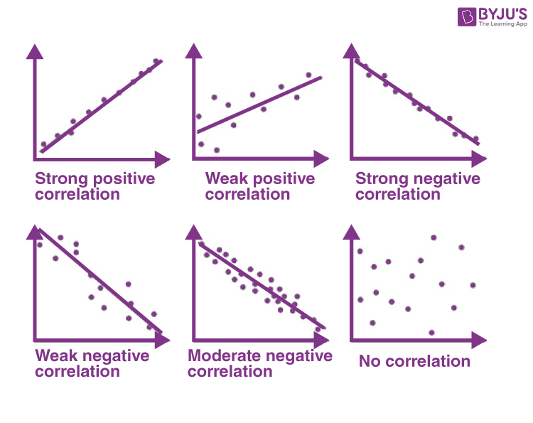
https://byjus.com/maths/correlation/
Further Reading
# pandas 의 corr() 를 이용하여 상관 계수 구하기
df_corr = df_iris.corr(method='pearson')
df_corr
| Sepal.Length | Sepal.Width | Petal.Length | Petal.Width | |
|---|---|---|---|---|
| Sepal.Length | 1.00000 | -0.11757 | 0.87175 | 0.81794 |
| Sepal.Width | -0.11757 | 1.00000 | -0.42844 | -0.36613 |
| Petal.Length | 0.87175 | -0.42844 | 1.00000 | 0.96287 |
| Petal.Width | 0.81794 | -0.36613 | 0.96287 | 1.00000 |
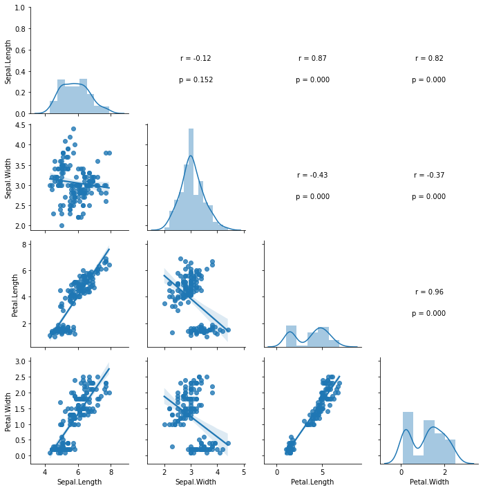
stats.pearsonr() 함수를 이용하면 상관 계수 r 및 p-value 값을 구할 수 있습니다.
상관계수의 수치만 보고 애매할때가 있는데 p-value가 0.05보다 작을 경우
H0 명제 ‘두 변수간의 상관 관계가 없다’를 기각
H1 명제 ‘두 변수간의 상관 관계가 있다’를 채택
할 수 있으므로 두 변수의 상관에 대한 판단을 좀더 수치적으로 할 수 있게 됩니다.
# https://stackoverflow.com/questions/63416894/correlation-values-in-pairplot
# stats.pearsonr() 함수를 이용하면 상관 계수 r 및 p-value 값을 구할 수 있습니다.
# 상관계수의 수치만 보고 애매할때가 있는데 p-value가 0.05보다 작을 경우
# '두 변수간의 상관 관계가 없다'는 H0 명제를 기각하고 '두 변수간의 상관 관계가 있다'는 H1 명제를 채택할 수 있으므로
# 두 변수의 상관에 대한 판단을 좀더 수치적으로 할 수 있게 됩니다.
def pearsonr(x,y,label=None,color=None,**kwargs):
    ax = plt.gca()
    r,p = sp.stats.pearsonr(x,y)
    ax.annotate('r = {:.2f}'.format(r), xy=(0.5,0.5), xycoords='axes fraction', ha='center')
    ax.annotate('p = {:.3f}'.format(p), xy=(0.5,0.3), xycoords='axes fraction', ha='center')
    ax.set_axis_off()

g = sns.PairGrid(df_iris)
g.map_diag(sns.distplot)
g.map_lower(sns.regplot)
g.map_upper(pearsonr)
<seaborn.axisgrid.PairGrid at 0x13e0e72e0>
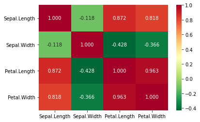
히트맵
데이터가 많은 경우 산점도를 그래프로 표시하는 것이 힘들 경우가 있습니다. 이때는 상관 계수값을 히트맵을 통해 시각화하여 좀더 빠르게 살펴볼 수 있습니다.
# pandas에서 구한 corr 테이블에 색을 입혀 간단하게 히트맵을 그려봅니다.
df_corr.style.background_gradient(cmap='YlOrRd')
| Sepal.Length | Sepal.Width | Petal.Length | Petal.Width | |
|---|---|---|---|---|
| Sepal.Length | 1.000000 | -0.117570 | 0.871754 | 0.817941 |
| Sepal.Width | -0.117570 | 1.000000 | -0.428440 | -0.366126 |
| Petal.Length | 0.871754 | -0.428440 | 1.000000 | 0.962865 |
| Petal.Width | 0.817941 | -0.366126 | 0.962865 | 1.000000 |
# seaborn의 heatmap() 를 이용해서도 나타날수 있습니다.
sns.heatmap(df_corr, annot=True, fmt='.3f', cmap='RdYlGn_r')
<AxesSubplot:>
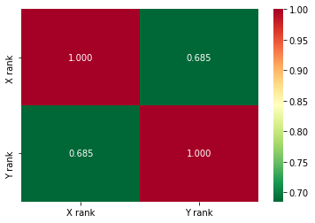
순위 상관
데이터가 서열 척도 같은 순위 데이터일 경우 두 변수 간의 상관 관계를 나타낼때는 순위 상관계수를 이용합니다.
스피어만의 순위 상관계수
순위 데이터를 가지고 피어슨의 확률 상관계수를 계산하면 스피어만의 순위 상관 계수임
https://slidetodoc.com/spearmans-rank-correlation-spearmans-rank-correlation-coefficient-measures/
켄달의 순위 상관계수
두 변수 X, Y에 대하여 소비자 1,2,3 이 각각 선호도 순위를 평가한 값에서 소비자 1,2,3중 두 소비자의 조합: (1, 2), (1, 3), (2, 3) 중 X, Y에 대한 순위의 크기가 일치하거나 일치하지 않는 쌍의 수를 이용하여 지표 계산
소비자 1의 순위 데이터 (X1, Y1), 소비자 2의 순위 데이터 (X2, Y2) 라고 한다면,
일치: X1 < X2 이고 Y1 < Y2, 또는 X1 > X2 이고 Y1 > Y2 일때
불일치: X1 < X2 이고 Y1 > Y2 또는 X1 > X2 이고 Y1 < Y2 일때
https://en.wikipedia.org/wiki/Kendall_rank_correlation_coefficient
df_race = pd.DataFrame(
    [
        [4,5],
        [10,8],
        [3,6],
        [1,2],
        [9,10],
        [2,3],
        [6,9],
        [7,4],
        [8,7],
        [5,1]
    ],
    columns=["X rank","Y rank"])
df_race.head()
| X rank | Y rank | |
|---|---|---|
| 0 | 4 | 5 |
| 1 | 10 | 8 |
| 2 | 3 | 6 |
| 3 | 1 | 2 |
| 4 | 9 | 10 |
# pandas 의 corr() 를 이용하여 순위 상관 계수 구하기
# method = 'spearman', 'kendall'
df_corr = df_race.corr(method='spearman')
df_corr.style.background_gradient(cmap='YlOrRd')
| X rank | Y rank | |
|---|---|---|
| X rank | 1.000000 | 0.684848 |
| Y rank | 0.684848 | 1.000000 |
# seaborn의 heatmap() 를 이용해서도 나타날수 있습니다.
sns.heatmap(df_corr, annot=True, fmt='.3f', cmap='RdYlGn_r')
<AxesSubplot:>
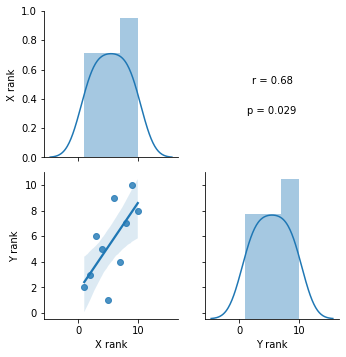
# stats.spearmanr() 함수를 이용 순위 상관 계수 r 및 p-value 값
def spearmanr(x,y,label=None,color=None,**kwargs):
    ax = plt.gca()
    r,p = sp.stats.spearmanr(x,y)
    ax.annotate('r = {:.2f}'.format(r), xy=(0.5,0.5), xycoords='axes fraction', ha='center')
    ax.annotate('p = {:.3f}'.format(p), xy=(0.5,0.3), xycoords='axes fraction', ha='center')
    ax.set_axis_off()

# stats.kendalltau() 함수를 이용 순위 상관 계수 r 및 p-value 값
def kendalltau(x,y,label=None,color=None,**kwargs):
    ax = plt.gca()
    r = sp.stats.kendalltau(x,y)
    ax.annotate('r = {:.2f}'.format(r), xy=(0.5,0.5), xycoords='axes fraction', ha='center')
    ax.annotate('p = {:.3f}'.format(p), xy=(0.5,0.3), xycoords='axes fraction', ha='center')
    ax.set_axis_off()

g = sns.PairGrid(df_race)
g.map_diag(sns.distplot)
g.map_lower(sns.regplot)
g.map_upper(spearmanr)
#g.map_upper(kendalltau)
<seaborn.axisgrid.PairGrid at 0x140bf5f10>